Alpha-1 Foundation
Website redesign for the Alpha-1 Foundation, a non-profit organization that supports and funds research on lung and liver diseases associated with Alpha-1 Antitrypsin Deficiency
Background
The Alpha-1 Foundation (A1F), dedicated to Alpha-1 Antitrypsin Deficiency (AATD) research, sought a website redesign to address its outdated interface, broken features, and poor user engagement. A1F's mission includes promoting genetic testing for early detection, supporting research, and providing education to both healthcare professionals and patients.
Challenges
The existing website struggled with issues such as disorganized content, lack of mobile responsiveness, and inefficient user data capture, which hindered fundraising and research efforts.
Objectives
The redesign aimed to modernize the site, enhance functionality and responsiveness, streamline content, and improve engagement to boost donations, awareness of AATD, and newsletter signups.
Contributions
- Conducted UX research, including surveys and heuristic evaluations.
- Led the information architecture redesign, creating a co-designed sitemap and intuitive navigation.
- Developed a lead generation strategy and redesigned forms.
- Designed and developed a design system, incorporating an interactive maps, and leveraging Bootstrap 5 for efficient customization.
- Contributed significantly to front-end and WordPress development.
- Managed project phases and mentored junior UX staff, ensuring effective team collaboration and client/vendor communication.
Team
Included a project owner, project manager, visual designer, junior UX researchers and designers, a WordPress developer, and myself as the UX engineer and lead.
Results
By refining lead capture forms, building custom specialist and support group locators, streamlining navigation, and improving content findability & mobile responsiveness, we achieved:
758.9%
increase in form submissions
40.1%
boost in resource downloads
We've also received the following user feedback:
- Information is now easily accessible on all screen sizes and devices
- Specialist and support group maps are fast & easy to use
- Video library and resource library make it easy to find relevant educational materials
- Overall design is clean and modern
Alpha-1 Foundation homepage before redesign:
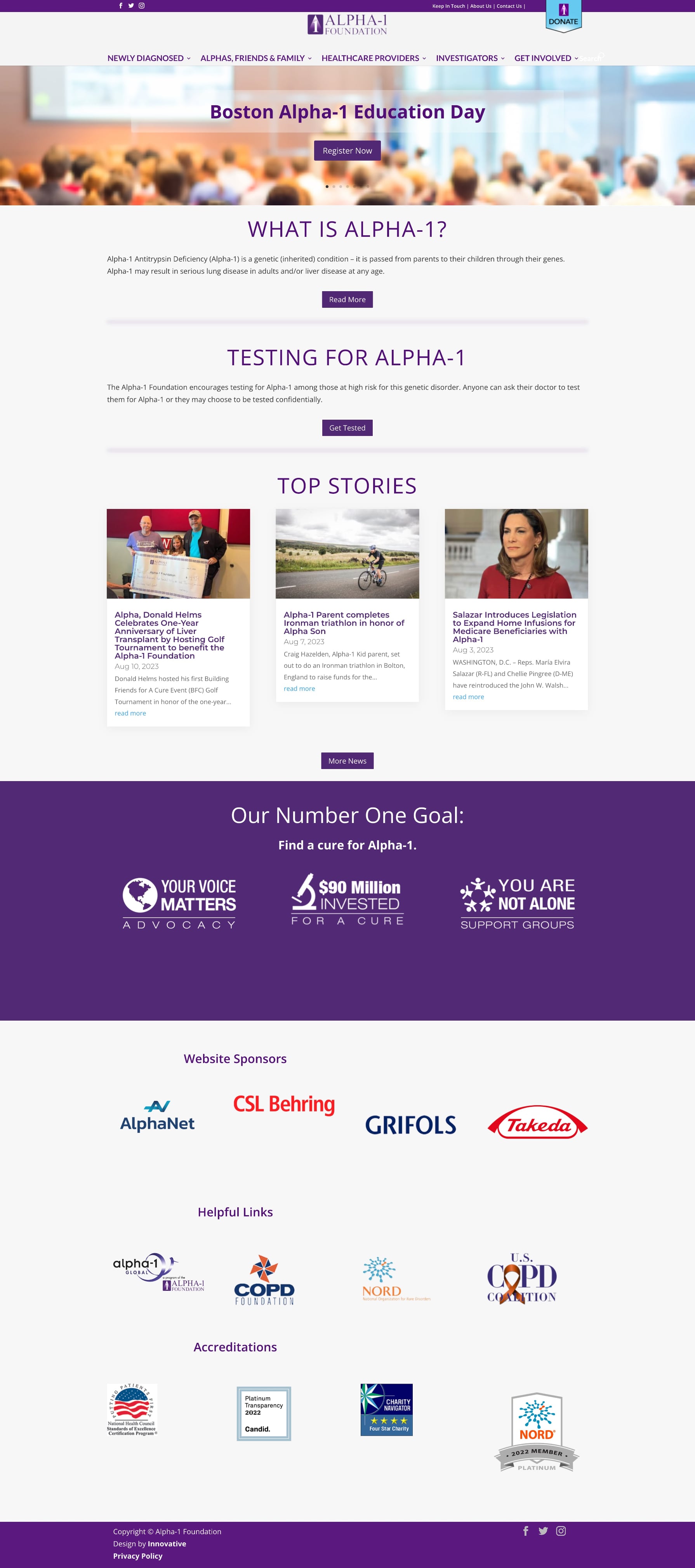
Alpha-1 Foundation homepage after redesign:

Before the redesign, users had to manually scroll through a spreadsheet of 100+ clinicians to find one. We built a custom interactive & searchable map that simplfied the process and drastically reduced cognitive load.
Find an Alpha-1 Specialist Map arrow_forward_iosStatic spreadsheet before redesign:
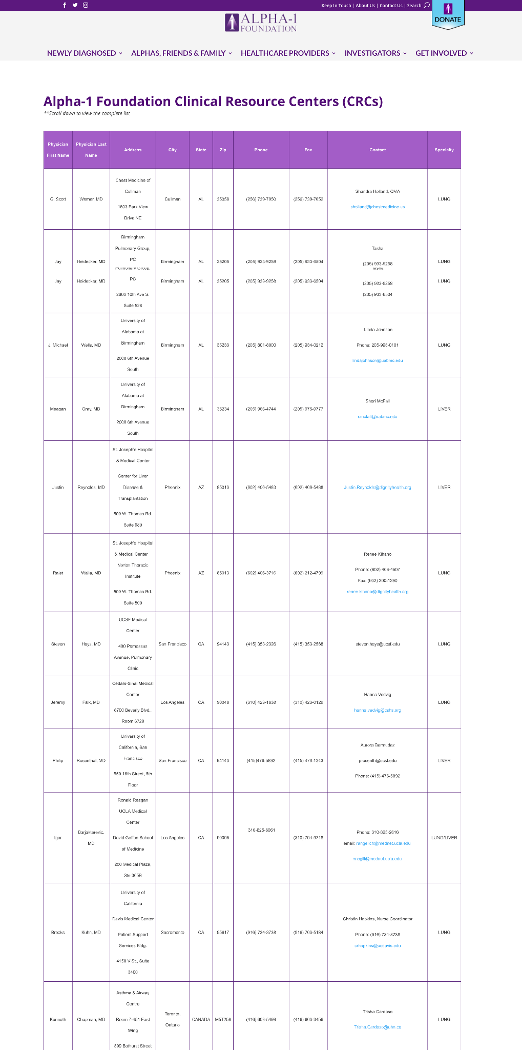
Interactive, searchable map after redesign:
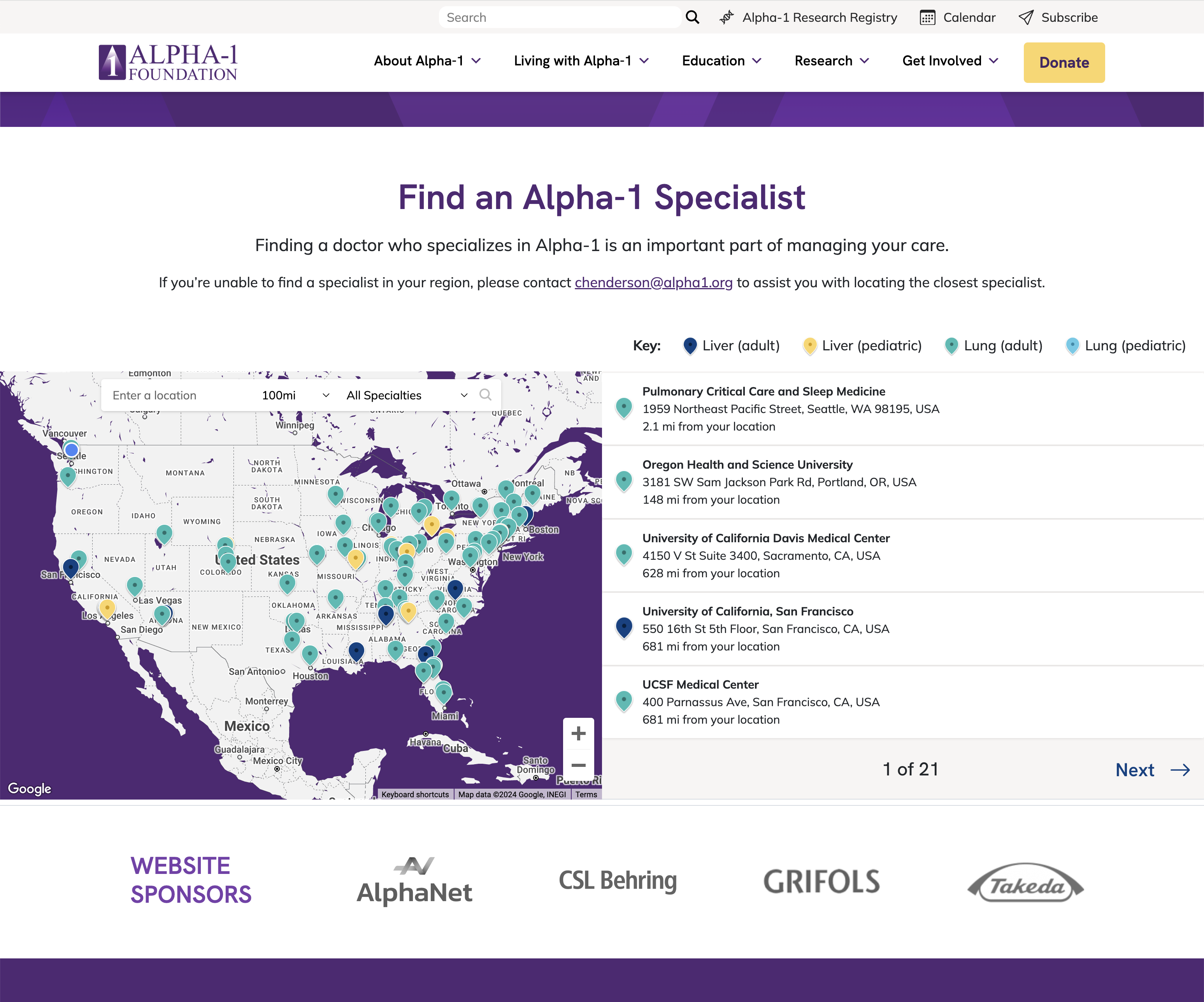
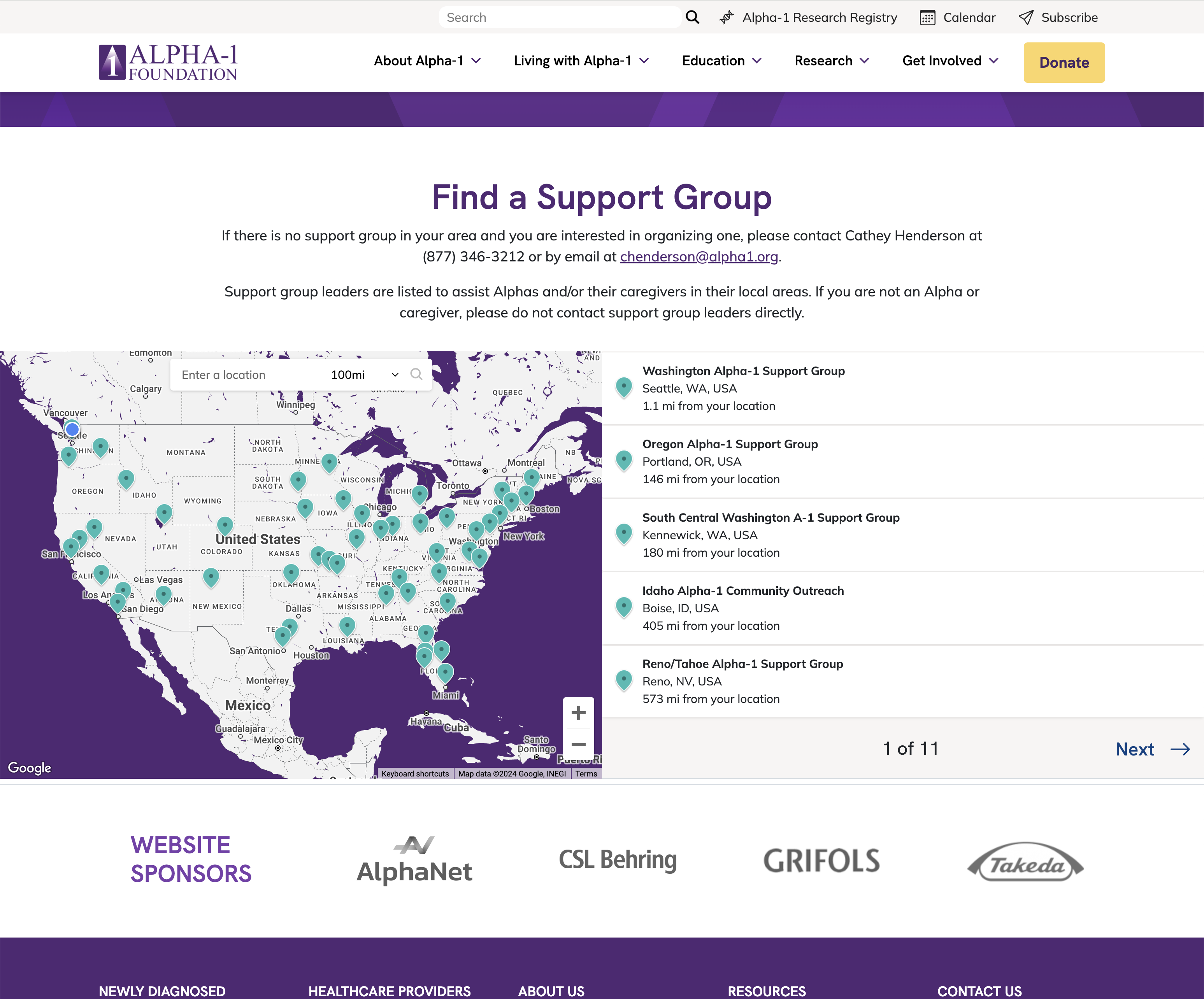
Before the redesign, users had to click into their state to see a list of providers. There may or may not have been a provider in a certain state. We built a custom interactive & searchable map that simplfied the process and drastically reduced cognitive load.
Find an Alpha-1 Support Group Map arrow_forward_iosClunky map with low information scent requiring page reloads before redesign:
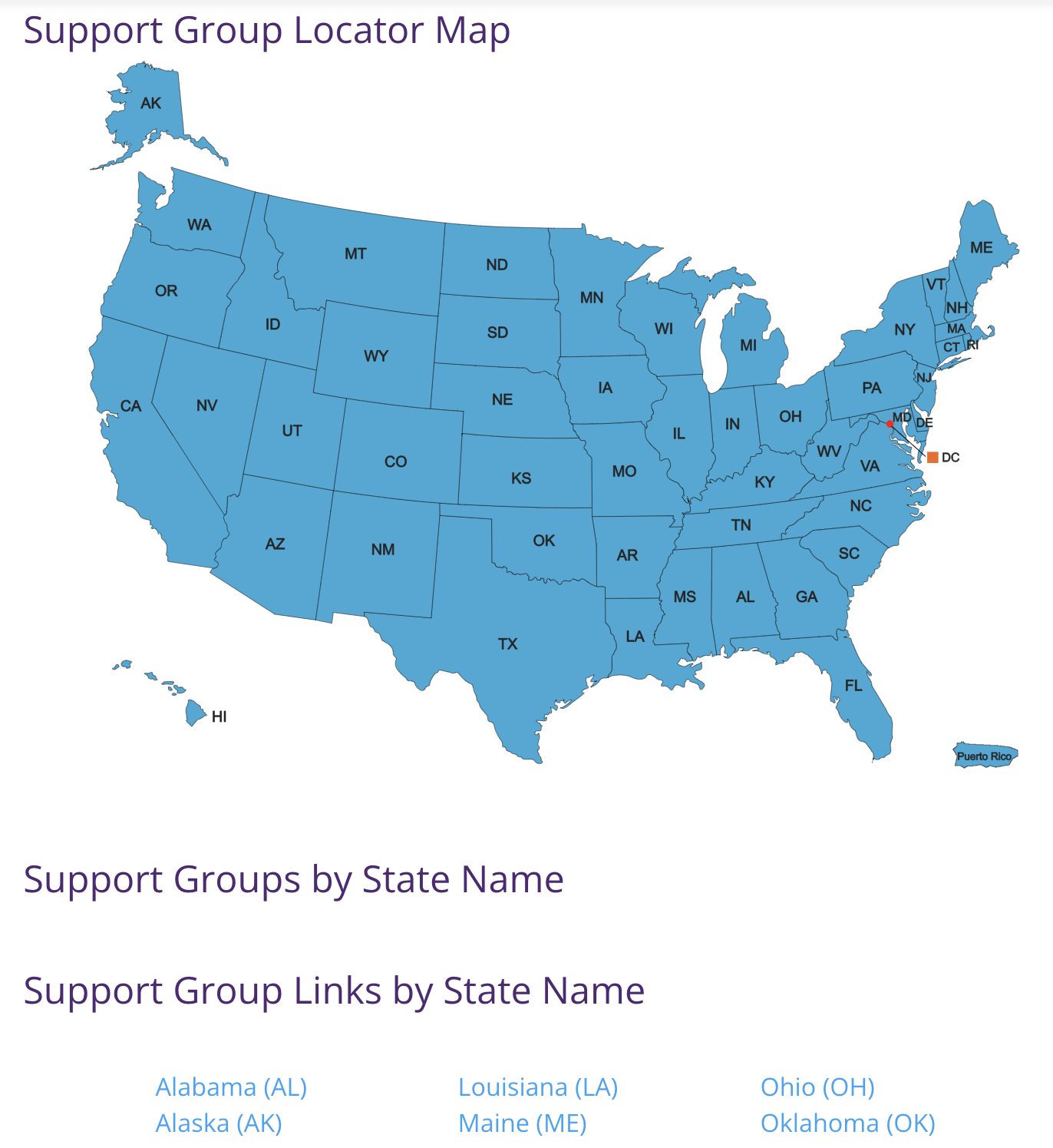
Interactive, searchable map after redesign:
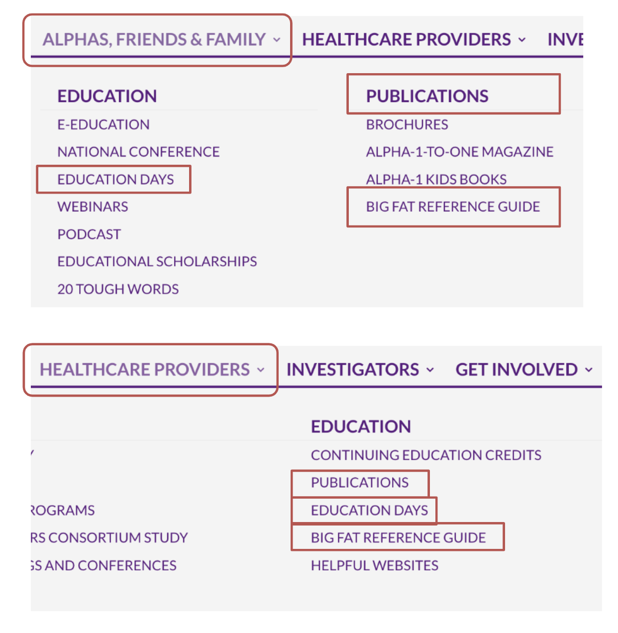
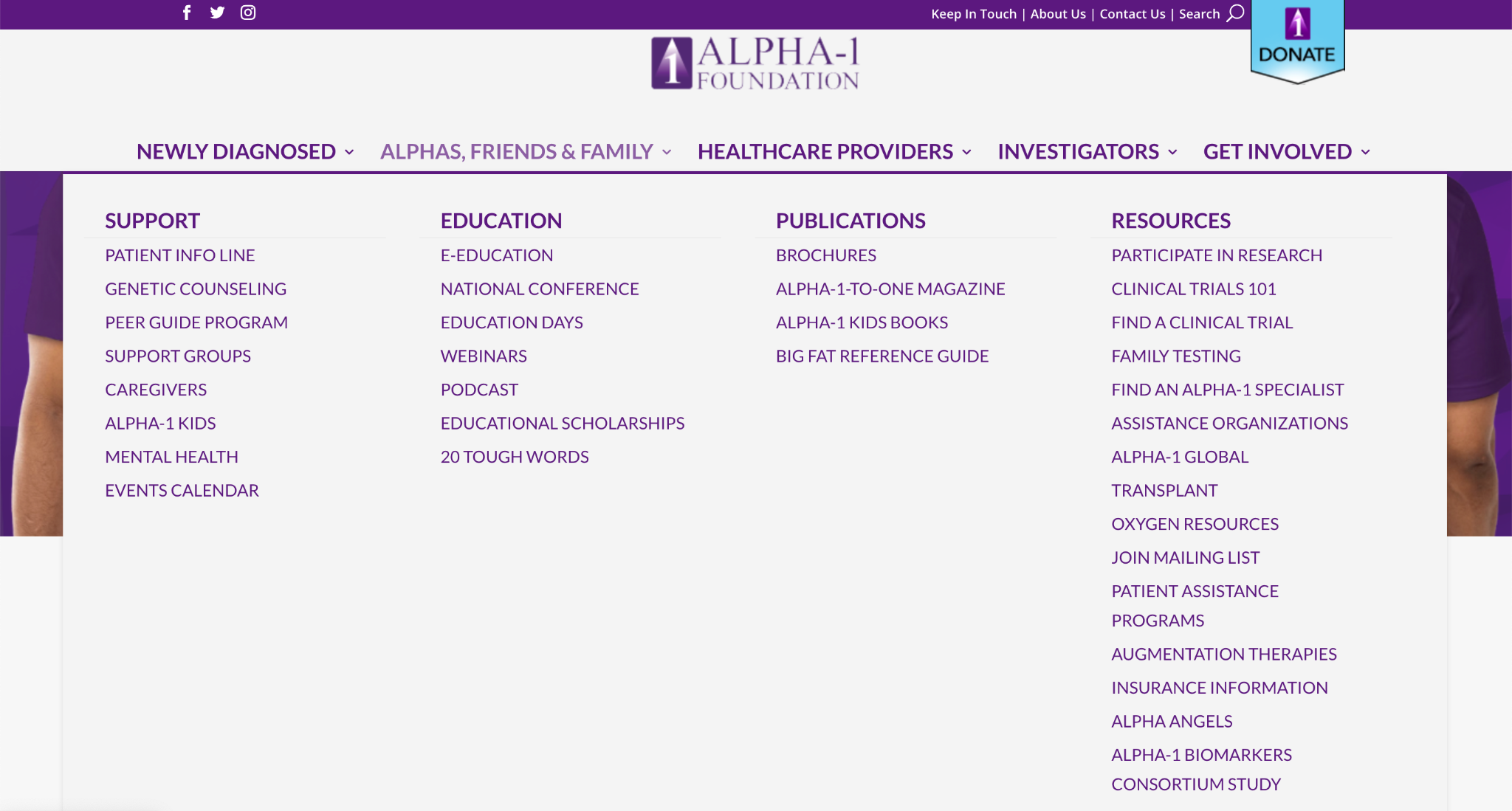
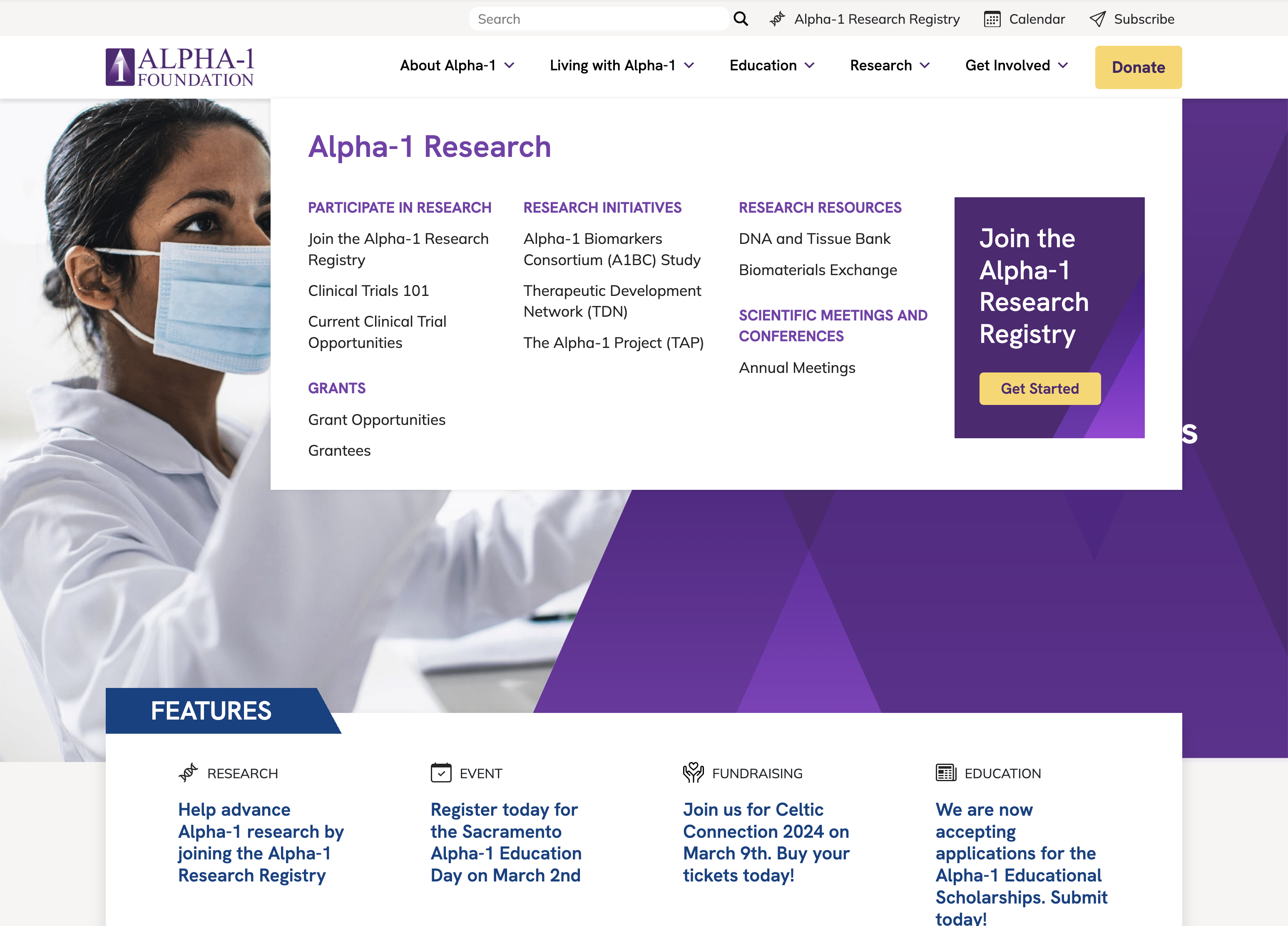
Before the redesign, the navigation was audience-based, which led to a lot of user confusion, as well, as repeated navigation items in multiple categories (polyhierarchy). After user research and performing a card sort, we found categories based on topics more closely matched the users' mental model, eliminating polyhierarchy and increasing content findability.
Navigation with polyhierarchy and audience-based categories before redesign:
Simplified navigation with topic-based categorization after redesign:
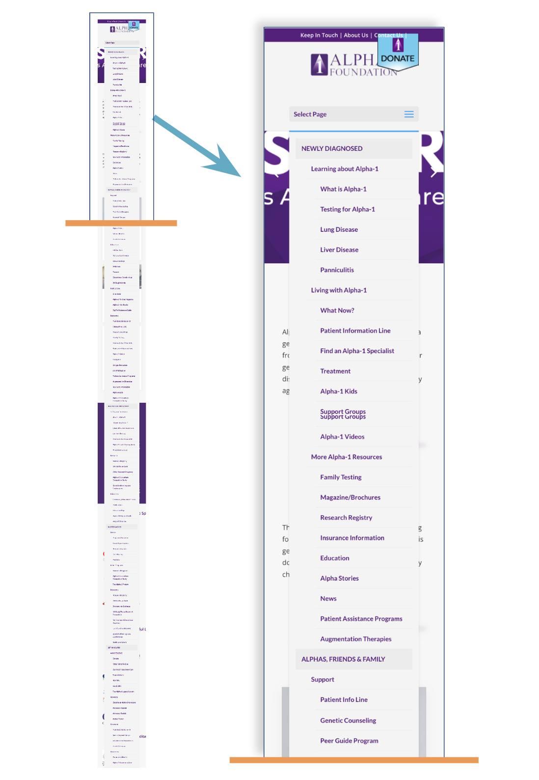
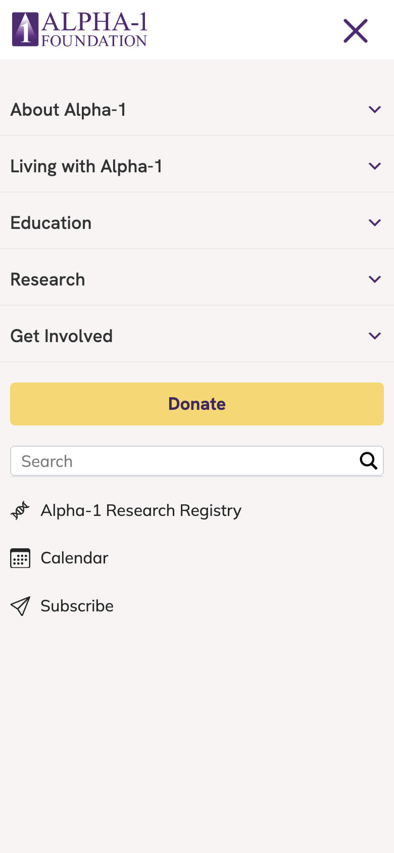
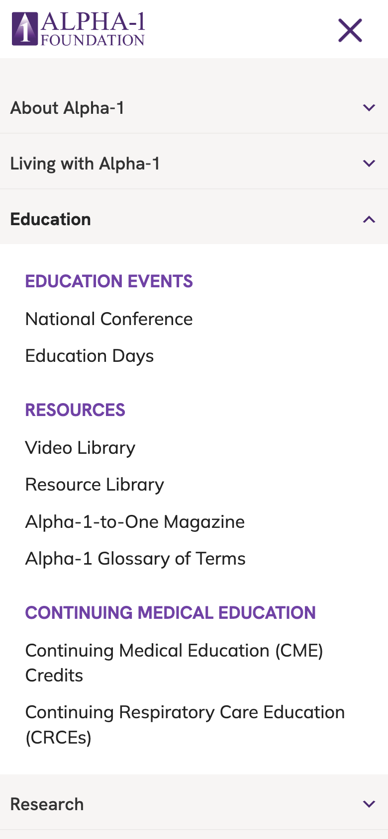
Before the redesign, users complained that the website was extremely difficult to navigate on a mobile device (tapping the hamburger menu would drop down a mobile menu that was well over 5,000 pixels tall) and that content would fit inconsistently. Following the new information architecture, we built a responsive mobile menu with collapsible categories, and standardized the layout so that content would fit perfectly across all devices.
Mobile navigation before redesign:
Mobile navigation after redesign:
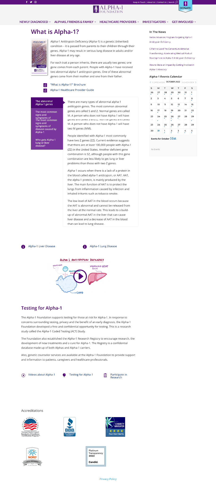
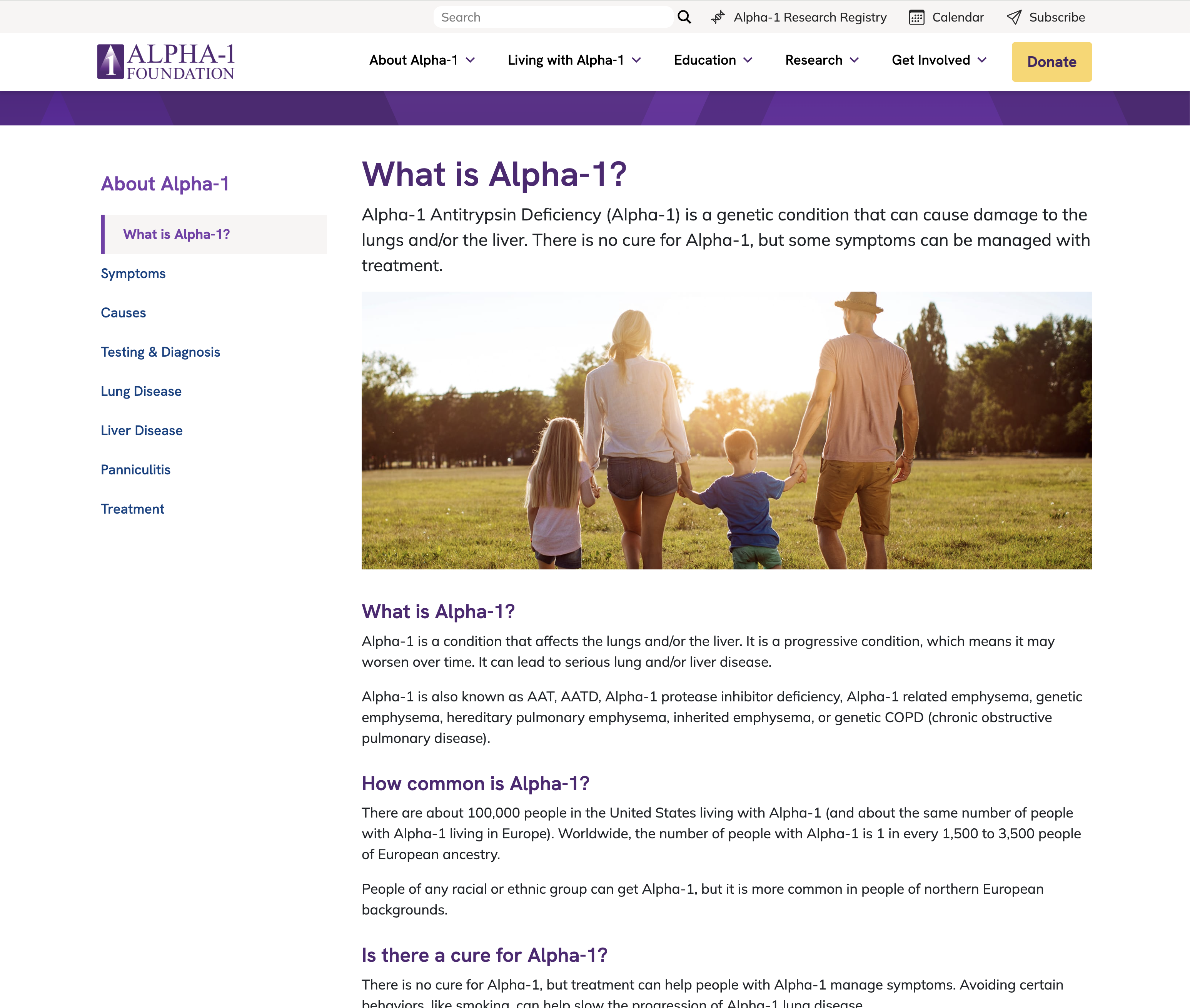
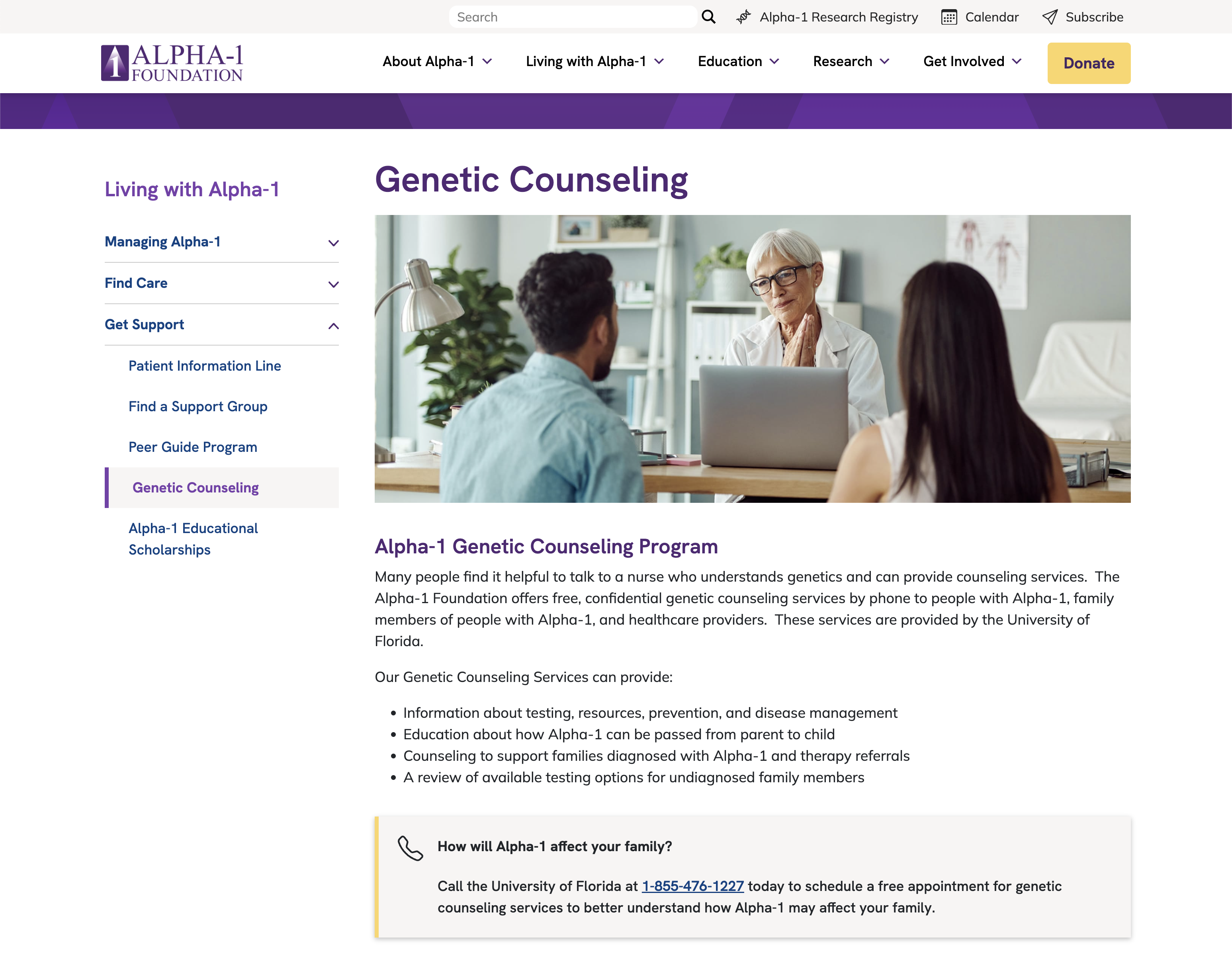
Before the redesign, content was poorly laid out and there was a lot of wasted space, including a persistent sidebar with news & events that weren't relevant to the user's actions. After user research, we redesigned content pages to follow a consistent layout with stronger CTAs, stronger visual hierarchy, intentional use of whitespace, and a categorical sidebar navigation to enable users to browse related content. We also ensured all content was legible and aesthetic on all device sizes.
Content pages before redesign:
Content pages after redesign:
Research and Discovery
To address both user needs and business objectives effectively, we devised a research approach that combined both quantitative and qualitative research methods.
User Survey
View slide deck of survey results →Key Takeaways
- Comprehensive information hub: users appreciate the website's extensive Alpha-1 information, finding it relevant, useful, and informative.
- Relevance across disease journey: the site effectively caters to users at various stages of their Alpha-1 journey, offering valuable content that evolves with their understanding.
- Community support: the website fosters a strong sense of community, evident in the positive feedback that highlights its role in creating a supportive environment.
- Addressing information gaps: The website bridges the information gap left by healthcare professionals regarding Alpha-1, offering unique insights not readily available elsewhere.
- Enhanced usability: users express concerns about overwhelming content, non-intuitive navigation, and mobile-unfriendly design. Improving organization and mobile responsiveness can enhance user experience.
- Effective information management: implementing user-friendly navigation and organized content structures can address the challenge of overwhelming information, making content easier to discover and explore.
Heuristic Evaluation
Design Principles Workshop
- Design principles and feature prioritization based on survey and heuristic evaluation
- Participants: staff / stakeholders of A1F
- Prompted with 3 “how might [we]…” questions to engage empathetically with users
Finalized Design Principles
- Simplicity and minimalism to help offset potential pre-existing overwhelm
- Intuitive structure to help people efficiently find the information they need
- Empathic and sensitive to user needs
- Data-driven to solve the right problems
- Accessibility and inclusivity as a focus (ADA compliance)
Target Audience
From survey results and stakeholder workshop / discussions, decided primary audiences for redesign would be:
- Individuals newly diagnosed with AATD, seeking information and resources
- Undiagnosed individuals; those seeking testing and genetic counseling
Prioritized Features
From survey results, heuristic evaluation, and stakeholder workshop / discussions, decided most impactful features would be:
- Specialist map and support group map with gated content to improve lead generation
- Resource library
- Searchable resource section for users to find relevant literature and materials about AATD
- Video library
- Library of video content, searchable and filterable by events, speakers, topics
- Calendar of events
- News / blog
- Redesigned forms
Card Sort
Hypothesis: based on established best practices and research, audience-segmented navigation creates confusion and forces users to self-identify into an audience category, while the information they seek could fall under multiple audience categories.
Method
- Open cart sort study on UXtweak
- 27 respondents completed the card sort
- About half of the respondents were recruited directly by A1F
Results
Respondents sorted information into topic-based categories; no respondents intrinsically sorted information into audience-segmented categories.
- Detracting factors for card sort:
- "Alpha-1" prefix on individual cards created grouping bias and compromised value of some data
- Ambiguity of some individual card names compromised value of data (e.g. jargon, branding making it difficult for new users to understand definitions)
Among other methods, we used Respondent-Centric Analysis (RCA) to explore the similarity of responses at varying thresholds to find patterns and decide on the final information architecture structure.
Information Architecture
Based on the results of the card sort, we moved forward with:
- Main navigation with a simplified, logical topic-based category organization, eliminating all instances of polyhierarchy
- Secondary "eyebrow" navigation for high-priority features/pages
- Footer with some curated categories (Newly Diagnosed, Healthcare Providers, Resources)
- Category sidebar navigation for content pages, instead of category overview/landing pages, to simplify site structure and enable quicker navigation
Design
- Navigation
- Visual design of components and content pages
- Design system
- Interaction design
- Prototyping with code (interactive maps)